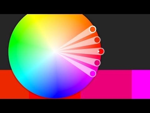
Color theory is one of the most important aspects of art. Photography is no different. If you’re interested in making fantastic images that stand out its a technique you’ll need to get a handle on. The relationship between photographers and color theory is particularly interesting in that the approach to color has changed entirely over the history of making photographs.
In the early days of photography, images were produced in monochrome. It would still be a few years before the autochrome process became available. But even processes such as color gum bi-chromate or even autochrome for that matter, were more involved than basic monochrome photography. In the early days, the process was natively monochrome and color had to be approached and thought about completely differently.
Today in the digital age this is the complete opposite. Cameras natively shoot color images which are transferred to the computer in an RGB color space. Monochrome images today are made by manipulating a natively color image. This is completely opposite of where photography started. Color theory has become something that’s thought about less since the images just come out in color.
What was the spectrum that you used though?
In Saul Leiter's taxi photo, another indicator of the car being a taxi is the man riding in the back.
keep up the good work, praying for you, Christ be with you.
Very informative video. Just loved it. Was trying to get a bit more knowledge about color theory and this helped me a lot. Thanks Ted. Love your content.
Wow– eye opening view of color! I learned so much from this video. Thank you teacher Ted :))
Slow down a bit!
Thank you so much )
Green is not a primary color either!! Green can be made from yellow and blue… the 3 primary colors are red blue and yellow
I definitely like how your style has evolved in the last 5 years 😀
I like what you are sharing with us, yet you are too fast 🙂
As a lighting designer, now photography enthusiast, this is incredibly helpful! Had no idea this site existed.
So much info…. Nice one..
My favorite part of art is how we all see and understand it differently. It is always humbling seeing other peoples work and an amazing opportunity to grow and learn. Thank you for sharing their work and maybe you could include links to their websites in the post for further research.
These videos are amazing
There's a little app out there online called "KGamut" that works similarly to this. You can drop a pic into KGamut and it will show he color gamut of the picture. Very useful.
Posted in 2013 still very helpful today! Thanks for the lesson!
Just discovered this channel and Im impressed by the content. Also impressed by how handsome you are, and thats really strange.
Thank you for the video! interesting and helpful 🙂
Ping pong table
Ther is a problem with choosing just any color wheel/model for finding color relationships. The model in Kuler/CC isn’t an RGB (or HSB) color wheel. The placements of the R, G, and B is’t spaced similarly to that. But one shouldn’t choose a mixing color model anyway. Such a model hasn’t much to do with how we perceive hues relative to one another (and if you work with nonlinear gamma as normal, what one believes is mixing complementaries isn’t).
I can’t find any official Adobe comments about what model is uses. But it says seems to be a variant of the RYB model. Probably Adobe made the worst choice then. The RYB model is a confused idea. (I could explain why, but I would be to much for here. It shouldn’t be used for anything that has to do with color design. It is the “flat eart theory” of color design, color mixing, and color science.)
So this app shouldn’t really be used.
The, possibly, best model to use for finding complementaries is CIE HCL/Lab. It is based on afterimage complementary hues (reflected light, D65 adaption). Another model used by designers is the NCS based on the psychological elementary hues (opponent process), although I has it’s issues. For finding analogous hues, possibly the Munsell model, based on perceptually equal spacing between hues, should be used. Also note that monochromaticy is different in the different models. I have no idea what is considered to be monochromatic in RYB, but CIE Lab is the most appropriate, based on wavelengths of light.
Learn about those models. And lets hope Adobe one day employs people who know about color theory.
he changed so much!!!!! amazing growth
Your explanations are GREAT… thanx for the video
Ted, your videos are truly astounding , great lessons !
Thank you so much!
Dany
Thank you for a great video
Ted, really love to hear you talk about photography and how some of the great names looked at the world, your thoughts are helping me see the world in more detail and with better composition, thank you keep up the great work and inspiration.
thanks for the video