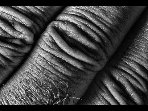
Exploring black and white photography is what this video is about and in this second tutorial in an ongoing series on black & white photography, Ray Scott investigates the use of texture and how it can touch the viewer by making the viewer want to touch the photo. The use of texture can also add a 3D quality to a photographers pictures and can really make images pop. Also, by eliminating colour the viewer has one less element to be distracted with. These black and white photography tips are designed to expose different ideas and techniques and to inspire photographers everywhere to pick up their cameras and try something new.
When in studio or in the field Ray uses Canon gear. This is a choice he made years ago knowing that he was buying into a system that he could grow into. His go to camera is the Canon EOS 6D with the second camera being a Canon 5D. Lenses used are all L series f/4 except for the 50mm macro with extender. 16-35mm f/4L, 24-105mm f/4L, and 70-200mm f/4L round out the kit which is carried about with either a Lowepro Urban Reporter 250 messenger bag for city shooting or a Lowepro Sling Bag for landscape field work. While Ray does more camera handholding than before due to the image stabilization capabilities of his various lenses, he still is a believer in using his Manfrotto carbon fibre tripod. It’s light and it is sturdy.
Ray is a firm believer in exposing himself to as much photography and its history as possible. By looking at other people’s photos, he has gained a big appreciation of what this medium has to offer. Ray doesn’t think that “copying” someone else’s style is a good thing but rather feels that exposing oneself to others work can work as a teaching and inspirational tool. With this in mind, Ray has amassed a list of favorite photographers that he uses for inspiration. Some of these artistic photographers are Galen Rowell, Ansel Adams, Frans Lanting, Annie Leibovitz, Henri Cartier-Bresson, Robert Capa, Freeman Patterson, William Neill and Richard Avedon.
One of the playlists on this channel is called “neighbourhood photographer” which covers tutorials shot in urban and suburban areas. It’s always a challenge to see different things of interest when you’ve been to an area many times yet this is the best way to create good images. You need to return to familiar locations many times. To do so, Ray often drives by car to an area but when he really wants to cover ground yet see things more clearly, he uses his bicycle…bike…and explores the given place.
Whether shooting landscape, macro, portrait or abstract images, Ray always tries to be aware of his surroundings to capture the best pictures possible. Part of this workflow means he is very aware of composition and uses various tips, such as the rule of thirds, as a good starting point in composing. He also likes to break rules from time to time to add new effects to his photos. Being aware of angles, shadows, shapes, lines, textures, patterns and colours goes a long way to making good pictures. He is also a big believer in “getting out there” and shooting as much as possible as it is the only way to improve and flex one’s imagination. His message is it doesn’t matter if you do your photography in the city, suburbs country, mountains or by the sea, just make sure you do it and follow your artistic passion.
Find me also on…
Twitter…
Facebook…
RAY you the best. Thanks
Very interesting… creates a totally new world! Thank you
Love your photos and your "vision" of photography. Thanks for the inspiration.
the tree looks like an octopus to me.
Love the cyclops tree photo (
: I love texture and will refocus my efforts. In film days I did take many texture photos. Also enjoyed developing B& W in the day (: Thank you so much for these excellent tutorials! I think you'd have great photo workshops!Fantastic video gentleman, what program do you use to convert pictures to W&B? And where can I found those pictures? I'm taking realistic drawing classes this pictures would help me to practice☺️ please answer back. God bless you!
Your b&W flower could have been even more dramatic with another pov to emphasize the textures of petals. You might have already tried it, but getting lower and closer to the flower may have better shown the texture. I found the white splotches on the periphery to be a bit distracting, so they could have been burned in. While in the color version there are no blotches, due to the more even (and natural gradients) of green color. Good Example for us to learn, BTW. Thanks.
Another good one. Not something new but a great reminder that we tend to forget or ignore.
I must agree with Pia on the B & W flower.. have a second look and see the small bumps and hollows which gives the lines something to go with or against ..I don't think flowers should be eliminated from the B & W theme
I love making my flower pictures black and white, gives the eye the opportunity to actually discover the depth without having the color to distract them
Great overall video as always, and great inspiration as well.
PS: I wouldn't go "there" with the flower, but I think it is a very valid experiment.