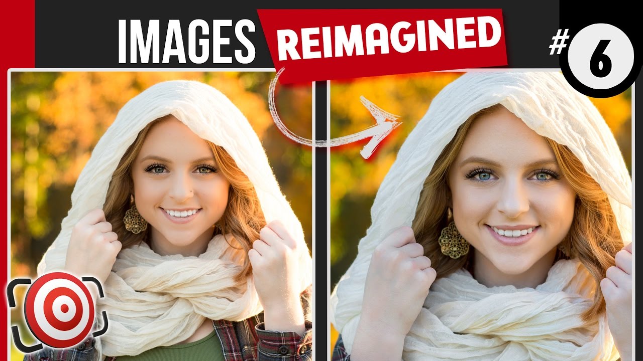
This week’s photo critique is of an outdoor natural light high school senior portrait by Mandy Weaver of Port Matilda, Pennsylvania. Mandy posted this portrait of a beautiful young girl in my Facebook Group. She explained that this was a natural light portrait shot at sunset with no additional lights or modifiers. She also explained that she was trying to create a beauty shot with the girls scarf and jewelry, but that it was an impromptu idea that had not really been planned for.
In this video I will walk you through my suggestions for how you can improve your photography and I will show you step-by-step the portrait retouching techniques that I used for this senior portrait.
Would you like to have your image reviewed?
SUBSCRIBE so that you don’t miss NEW VIDEOS!
PATREON
Help me HELP YOU:
or donate via PayPal:
MY WEBSITE & BLOG
WANNA SEE MY GEAR?
SHOP FOR TOGSWAG℠
LET’S CONNECT!
– Like & Follow on FACEBOOK:
– Follow on TWITTER:
– Follow on INSTAGRAM:
– Check my boards on PINTEREST:
– Connect on LINKEDIN:
– Connect on GOOGLE+:
FTC Disclosure: No sponsors have paid for or provided equipment or material shown in this video
#ishootpeople #joeedelman
What is the reason you generally don't like jewelry in portraits, as well as removed the nose piercing? Is it just personal taste or is there an ethos to the preference other photographers might benefit to consider?
I like them both, but not a fan of black and white.
The color in this image seems to be who this girl is. I've always heard, "Black and white is reality." In this case tho orange overtones of the original photo seems to be who this girl is; her basic essence. The B&W version, flattens her out. While she is pretty and both versions are appealing, I'll take the color in this case. I see this video was shot in 2016. I would welcome a critique of some of what I've done. Are you still accepting shots from your viewers? I don't mind criticism. It's the only way I'll get better.
Joe Edelman Just top work is all I can say…
B&W Thanks for being amazing!
Color!! But B/W was nice too
The color version to me is more attractive.
color…I like color images.
Sir please make photo shop and Lr tutorial from the beginning for beginners.
the crop just spot on…
YOUR edition and COLOR version, just the face could have a little more brightness.
Thank you
thanks for the great video:) Joe do you have any preferred way to whiten teeth in PS?
Color all the way 🙂
Joe love both of you edits but I think I prefer the black and white over the color. The reason is that the black and white focusesmy attention more to her face. The autumn colors were a bit too bright and drew my focus away from the subject. Again love both just prefer the b&w.
color. This is a beautiful young lady, so the eye color and hair color just drive the whole thing home. but the adding details in the scarf and recroping really do look better. great job to the photographer for getting a good quality to begin with.
I love the black and white!
Hey Joe, I shoot high school student quite often and there are lots of photos to edit (like 15 photos per person and last time I shot 12 people). It's impossible to edit each of these photos for 1 hour. What would you do?
I like the autumn colors. Also, thanks for the tip to over-plan the shoot with at least one other wardrobe option.
Absolutely loving your videos! As for a better picture at the end, I'm naturally attracted to B&W but in this case I do love both of the results 🙂 My 6 year old daughter concurs :))
Great edit! I prefer your crop but with color since those colors are only captured at a small portion of the year. Great advice for the photographer who submitted their photo. Overall, they had a great image 🙂
I am a big fan of B&W, but I love the color version of this photograph. It really brings up the fall colors and the beautiful eyes of the girl.
Thank you for all your videos!!! XO
you are really helping me see what is wrong with my photos. with this one, I just see a pretty girl in focus and think it is great and yet your work makes such a difference. thanks
for the inspiration
The color version definitely! Also, I would get rid of that blue tone on her hands. Great job Joe!
Nice tutorials
I really like the color version my self. I know Mandy quite well and feel she is going to be one of those Central PA Photographers that people will flock to. I love your ideas Joe and thanks for making this photo that much stronger.
I think that the black and white version works really well, but the colour just gets my vote. Your crop focusses the attention to her face and the distracting highlights of the original have been nicely dealt with. The only issue that I have now is with that vertical line of bokeh on the left of the image. I would tone that down as it is a distraction. Anyway, another excellent critique and reworking, Joe.
En este caso prefiero el color….muy buenos tus videos…..adiós!!Q!
Black and white for me.
Definitely colour, why would anyone need autumn for if not for its colours. 😉
color
Black & white